I can’t begin to tell you how many times I’ve attempted to select a paint color and it has ended in either tears, drinking or both.
Usually both.
Throwing of hands in the air, slamming of fists on tables and/or walls is typical as well.
Obviously, buying sample pots of paint and testing those out on your walls is the way to go, but if I bought a sample pot of paint for every color I thought may work, I would have a closet full of sample paint pots.
One of my biggest challenges is often coordinating paint colors throughout my house – thus why there is a lot of black and white in my home. However, a few months back I went to a meet-up at the Behr paint headquarters in Atlanta and had an ‘Ah ha’ moment.
Also, Behr isn’t paying me to tell you this, I just think that everyone in America should know this so we don’t all spend a combined $1 trillion dollars on paint samples and/or doctor’s bills that resulted from hitting walls after still not being able to find a paint color after 20 freakin’ samples.
How to Coordinate Paint Colors
This post contains affiliate links for your shopping convenience. Click here to read my full disclosure policy.
Seriously, you’re gonna love me for all time after I tell you this.
Ok, this is the Behr color center at Home Depot.

The color center is broken down into eight horizontal rows.
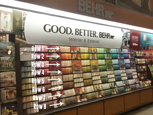
Rumor has it that every paint color within rows one and two coordinate with each other. The same is true of rows three and four, rows five and six and rows seven and eight.

Therefore, if you select paint colors from within the same row group (i.e. rows 1 & 2 or row 3 & 4 or row 5 & 6 or row 7 & 8), then all those colors will coordinate or harmonize well throughout your house.
I know, right, mind blown. Or at least mine was.
So I tested their theory. I went to Home Depot and randomly grabbed paint chips from the various rows, noting what rows they came from. These are all paint chips from rows one and two:

Y’all. They weren’t lying. The top picture consists of all the color cards I got from those two rows and the bottom images are just cards I pulled out to show that the theory really is true.
Now, not everyone loves that much color. Here are paint chips from rows five and six – more muted tones:

Once more, they all harmonize well together.
I also grabbed some color cards from rows seven and eight:

And those worked too! As you work your way down the color center, the colors tend to get less bright. I failed to get color cards from rows three and four as the employees started looking at me a little funny, so I just took what paint chips I had and ran.
Isn’t that so cool? While I will always love a good black and white paint combination, I am so glad to know this little trick because it will come in handy at the 70’s Landing Pad since I haven’t figured out all the paint colors there just yet.
Did you know about this? Please don’t tell me I’ve been living under a rock for the last 10+ years of my painting life!
Here are more home decorating posts you’ll find helpful too…
How to Make a Moodboard for Room Designs – making these boards are easy and they are great for helping you determine what will and won’t work in your design!
Decorating on a Budget – 5 Ways for Decorating Your Entire Home on a Tiny Budget!
6 Decorating Ideas to Distract from Popcorn Ceilings – before you make a mess and go scraping them off, read this first!
Free Printable Project Planner – a printable planner that will help you plot out your next room makeover and stay on budget.

You know you don’t wanna miss any of this crazy.
Sign up to get my posts delivered to your inbox here.
Stalk Me Here:
Pinterest / Facebook / Twitter /Instagram


Meaghan says
Such a great tip!!! This is AWESOME!
Jenna @ Rain on a Tin Roof says
So awesome!!!
Stephanie, Sandpaper And Glue says
so, so helpful! I have painted my whole house at least twice now, and I’m currently amping myself up to paint the living room for the fourth time. Ugh. Next time we move I’m painting everything white and forcing myself to live with it before a year before anything can be changed again! haha.
Jenna @ Rain on a Tin Roof says
Girl, I feel ya. I don’t think I could ever accurately count how many times I’ve painted rooms in my house. And honestly, I don’t think I want to know. It might make me sick! haha!
Whitney Shortt says
Um holla! Why is that not more universally know?!?! Mind. Blown.
Jenna @ Rain on a Tin Roof says
That’s what I thought too!! I was like, you guys should be shouting this from the rooftops!!
Paula says
You are the best! Thanks for making this simple for the coordinatly challenged!
Jenna @ Rain on a Tin Roof says
Girl, you have no idea how often I am coordinated challenged!! haha!
Lori M says
Oh. My. Martini.
(Or Margarita or Rum ‘n’Coke or Gin ‘n’Tonic… you get the idea)
I never knew that and am now wishing I were at the paint isle just to try some colors out!!!!
I thank you.
My minibar thanks you.
And my floors (which I may or may not stomp around on when trying to choose coordinating colors) thanks you.
You rock 🙂
Jenna @ Rain on a Tin Roof says
I have never heard the phrase ‘Oh. My. Martini.’ That is epic in itself and you can bet your bottom dollar I’ll be using it from here on out!!! Anywho, yes – isn’t it the coolest tip? And incredibly helpful to our liquor stash and floors! 😉
cassie says
Does this method hold true for all brands of paint sample displays? Sherwin Williams, Benjamin moore for example?
Jenna @ Rain on a Tin Roof says
I don’t know about that, Cassie. I haven’t tested it out with those brands.
Jenny says
Have you tested it at any other stores yet? I’d love to know if SW and BM are the same way!
Jennifer says
Gasp! I didn’t know this! Thank you for sharing! You are a gem!
Jenna @ Rain on a Tin Roof says
You are welcome!!
Kate says
thank you, thank you, THANK YOU for this! LIFE CHANGING!
Jenna @ Rain on a Tin Roof says
Girl, you are welcome!!! I totally agree- life changing!!
Pam S says
Holy crap on a cracker…..I did NOT know this! ~Thanks! 🙂
Jenna @ Rain on a Tin Roof says
‘Holy crap on a cracker’ – I could not have put it better myself. 😉
Cheryl says
DAMN! Who knew. I’ve looked at the brochures with suggested samples for the room pictured but never, ever made a connection to the rows. I must have hundreds of paint sample cards stuck in drawers around here. Colors, Here I Come!!!!
Jenna @ Rain on a Tin Roof says
Girl, I was in shock too!! SO glad I know now!
Stephanie @ One Mile Home Style says
How did we not know this!?! My paint shopping trips are going to be so much faster now!
Jenna @ Rain on a Tin Roof says
I know, right??! Mine too!
Patty says
HAHA, I actually got one on you girl. I figured it out one day when I was at Home Depot looking for a peach or orange color and I noticed all the colors right in front of me then I noticed how the the other colors went so well with them then I moved to section three and so on & so on. I ended up mixing my own paint that day, but I have been back and it really does make things easier especially when you are painting a piece of furniture and you are going to use more than one color or do an ombre it is so helpful.
Jenna @ Rain on a Tin Roof says
Well, why didn’t you tell the rest of us, Patty???! haha!! It is really helpful – I’m so mad I didn’t know about it sooner!
Karen J says
Go figure!!! Wish I had known this years ago but it does make sense now that you have shown us. Once again, you hit a home run. Makes Mama Wanna Be so proud!
Jenna @ Rain on a Tin Roof says
Oh, I just love you mama wanna be!
Brigitte says
OMG…..you just changed my life. Mind BLOWN!
Jenna @ Rain on a Tin Roof says
Mine too!
Tara says
So if 1 & 2 coordinate and 3 & 4 do as well, does that mean 2&3 can work?
Jenna @ Rain on a Tin Roof says
That I don’t know, Tara. I didn’t try it.
Susan the Farm Quilter says
What a great tip! However, I hate painting, so I will use more neutrals on my walls and use accessories to bring pops of color to my rooms – cheaper and easier to change accessories then to re-paint 🙂 I’m currently lusting after gray for my walls…but since I will not be painting again in my lifetime, I have to be sure!
Jenna @ Rain on a Tin Roof says
hahaha!! I get it, Susan!
cherie says
In all my centuries of painting, I never knew this!!! What a great tip! Thanks for passing that along!
Jenna @ Rain on a Tin Roof says
You are welcome gal! Hope it helps you out!
Stahli says
This makes me so wish that the paint stores were open at 10:30 at night! WOW! I can now step out of my self imposed paint time-out and get busy!!
Thank you Thank you Thank you!
Jenna @ Rain on a Tin Roof says
hahahahaha!!! I have been in those paint time-outs SO many times!!! Hopefully, it will be less stressful for ya now.
Paige says
Oh my gosh! Ditto mind blown. Really. Wow, wow, wow. This has got to be one of the best tips of all time! Thank you so much!!!
Jenna @ Rain on a Tin Roof says
I know, right?! Mind blown here as well!
Lisa says
Holy moley. Just. WOW.
Jenna @ Rain on a Tin Roof says
You are right, girl!
Debbie says
I was clueless……so thanks a million. Have you seen the latest Southern Living. Find it, get it and I won’t spoil
the surprise BUT a great article on that Southern author you just met.
Jenna @ Rain on a Tin Roof says
Do you mean the one with the article that features his mama too?? If so, I LOVED it!!
Kathryn says
The clouds opened up… And I hear angels singing!
Jenna @ Rain on a Tin Roof says
Same here, girl!
Beth says
That is fun to know! Behr is my go-to brand. We’ve moved a lot {read: my 6 year old lived in 3 states before he turned 3} and in each house I find I want a fresh start. Since our furniture stays the same, it’s the paint, pillows, curtains and things like that that get a reboot. I have always found it helpful to find a jumping off fabric – once it was a pillow, once it was some yardage that I used to upholster a bench – and base my colors off of that. Every room in my house can be a different color, but if they play well together, it looks intentional and put together. I don’t actually pick every color directly from the fabric, but if I think the fabric looks good in the room, I’ve made the space cohesive. It allows me to play around a lot more, moving things from one room to another and keeping it fresh. Just a thought for your new adventure! p.s. I grew up in Chattanooga!
Jenna @ Rain on a Tin Roof says
I like to find a jumping off point too, Beth – I think it just helps with the whole room and gives some direction!
Denise says
This is life changing info! Wait till I tell my husband! How many hours and $$ have I spent looking for the right colors? My only question would be…why the heck don’t they tell you that in the store??
Jenna @ Rain on a Tin Roof says
Changed my life too, girl! Ya know, I wonder if the people that work at the paint desk in the stores actually know this?? I’m not sure…
shauna says
I think the reason the colors in rows 1-2, 3-4, 5-6, etc go together is because the paint colors are sorted into rows based on their color saturation. The top rows have the brighter, more saturated colors (ie, the blues are more blue) while the bottom rows have the more muted, less saturated colors. The “all the colors in these rows go together” result is more of a side effect. Good observation!
Jenna @ Rain on a Tin Roof says
You’re probably right, Shauna! Hadn’t thought of that!
Paula says
I’ve always struggled with paint colors matching or coordinating with each other. Thank you Jenna. I have colors in my house right now that are going to be new colors shortly! You’ve shown me there is hope!
Jenna @ Rain on a Tin Roof says
Yay, Paula!! So glad I could help!
Leilani says
What a fabulous tip! I never knew this before, and perfect timing for me to stumble upon your discovery. We are about to paint 3 adjoining rooms and I didn’t want them all the same color. Skipping off to Home Depot as soon as they open. 😀 Behr Premium paint with the paint & primer in one is my favorite. 🙂
Jenna @ Rain on a Tin Roof says
Awesome, Leilani!! Have fun painting!
Karen says
Do all paint companies, .e. Sherwin Williams have a similar system? I need all the help I can get. Thanks
Jenna @ Rain on a Tin Roof says
I’m not sure about that, Karen. I bet you could ask them when you go in their store next time though.
Christene Holder says
I seriously had no idea about this! Thanks for the tip – Pinning 🙂
And, thanks for sharing with us on the Family Joy Blog Link Party
>> Christene
Keys to Inspiration
Jenna @ Rain on a Tin Roof says
You are so welcome Christene! Glad it was helpful!
Jessica says
We are in the middle of remodeling our house so this post is SO helpful. Thanks for sharing!
Jenna @ Rain on a Tin Roof says
Happy to help, Jessica!
Morgan @ Morgan Manages Mommyhood says
Uhm. this is a GAME CHANGER. I can’t even – genius! Thanks for sharing at Share the Wealth Sunday!
Jenna @ Rain on a Tin Roof says
Glad it was helpful, Morgan!
Theresa says
This is awesome for several reasons; I’m a color person and love mixing and matching in rooms. And that I never knew this trick.
Jenna @ Rain on a Tin Roof says
Great, Theresa! Glad it was helpful!
Theresa says
Woops forgot to say; Thanks for sharing at the #InspirationSpotlight party. Shared
brenda says
I found this out years ago but had almost forgot it, thanks for posting this. I think the one thing people don’t paint enough is their ceiling. You may have mentioned this in another article. I learned if you pick a color, just go to the lightest color at the top of your color card to paint your ceiling to make the room look more pulled together, if you feel the color might be too dark…add some warm white to it (unless you want a cooler color; then cool white). I like how it makes ceilings have a bit more character since it’s such a large, uninterrupted space. I just purchased a home in the Pigeon Forge, Tenn area and am in process of picking colors to paint next week…the whole house. sigh…:)
Jenna @ Rain on a Tin Roof says
Yes, I love painted ceilings, Brenda!! Unfortunately, I don’t paint mine often because I have popcorn ceilings which are a pain in the butt to paint. Best of luck with your new home in Pigeon Forge – I’m sure it will be gorgeous! Hope you weren’t affected by the fires there any!
Brenda says
Ugh. Popcorn ceilings. I feel your pain. My house is still standing but smells smokey on inside. I was glad I had not painted yet. I’m enjoying your website
Jenna @ Rain on a Tin Roof says
Glad your home is ok, Brenda! Definitely a good thing you hadn’t painted yet. I hope the smell clears up soon and you can get to work!
Deborah Gray says
Oh, wow, what a great tip! Yes, I know this is a year later, but I’m just looking for a solution now to choosing new paint colors for my house and you happened to write this on my birthday so I took it as a sign. Ha. My house is way overdue for a makeover and the last time we did this it took us three different complete paintings of the family room to get the color right. And I’m not that happy with the way the rooms flow into one another. I felt I needed professional help this time. I have no doubt this will save us a whole lot of trouble!. Thanks! One thing I’m still confused about is how to introduce a bold color (say red/burgundy) for one accent wall in the dining room. How do you pick that from another row to coordinate with a palette of neutral grey/beige/brown/cream?
Jenna says
Glad it was helpful, Deborah! Within the row of the color you chose, there should be other colors that are more bold as well. For example, if you look in the picture, you can see that even in the row with beiges, there are also deeper red colors.
Frances says
Wow ! Thanks , Knowing this will be a lot of help this Spring when I paint the inside of my house.
Kim~madeinaday says
Who knew!! This is awesome! Pinned ! Thank you for sharing on Merry Monday! Hope to see ya next week!
Kim
Debrashoppeno5 says
This is so helpful. Especially when you have an open concept house and all of the rooms flow into each other.
Jean | DelightfulRepast.com says
I had no idea! Why don’t they put up a big sign telling people that!
Jenna says
Right?! I was blown away when I first found out about it.
Nicole says
MIND BLOWN!!!! This is such a cool thing to know, I am so glad you took the time to tell us. Now I want to go to our Behr Display so I can test it out myself. LOL Pinned. Thanks for sharing your post with us at the #HomeMattersParty this week.
Erlene says
Holy smokes. Why have I gone my entire adult life not knowing this info? WTH, would have made coordinating so much easier. Why isn’t this boldly posted? LOL. Thanks for the info.
Gigi Sanchez says
If you go horizontally instead of vertically (ie: from blue to orange, red to green, purple to yellow), will you find the color’s compliment? IE: If you’re at the blue section at the 1st chip in the second row, will its orange compliment be in the orange section, the 1st chip in the second row?